How to preview a palette and export a light/dark theme
See your colors on illustrations, lettering, logos, patterns and website mockups, set each role, check the contrast pairs and export the CSS.
Open the visualizerBrowse your palette on real designs
The gallery shows your palette on 59 designs: hand-lettered posters, patterns, logo colorways, illustrations, business cards, posters, product mockups, app screens, websites and more. Use the filters to narrow them down, and switch between large and compact tiles. Click any design to see it full size, and use the arrow keys to move between them. The palette bar at the bottom is always in view: hover a swatch to see its hex code, click it to change that color, or press its padlock to keep it when you generate. Every design updates live, and undo steps back through your changes. The designs are previews, not clickable.
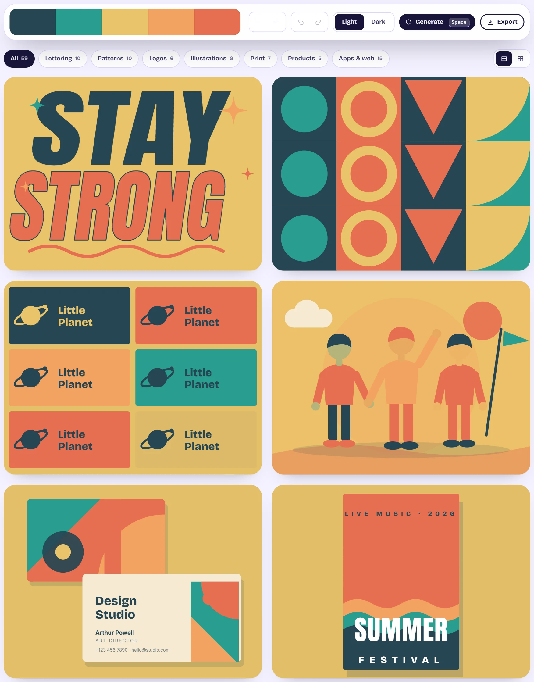
The visualizer gallery of designs recolored by the palette, with filter chips above it and the palette bar showing five colors, undo and redo, a Light and Dark switch, a Generate button and an Export button Set the roles and read the checks
Below the gallery, Roles lists Background, Surface, Text, Muted text, Primary, Secondary, Accent and Border. Each starts as Auto. Choose a palette color or Custom to set one by hand, and press the padlock to lock it so a fix can never change it. Contrast checks lists every pair that matters with Pass or Fail and the exact ratio.
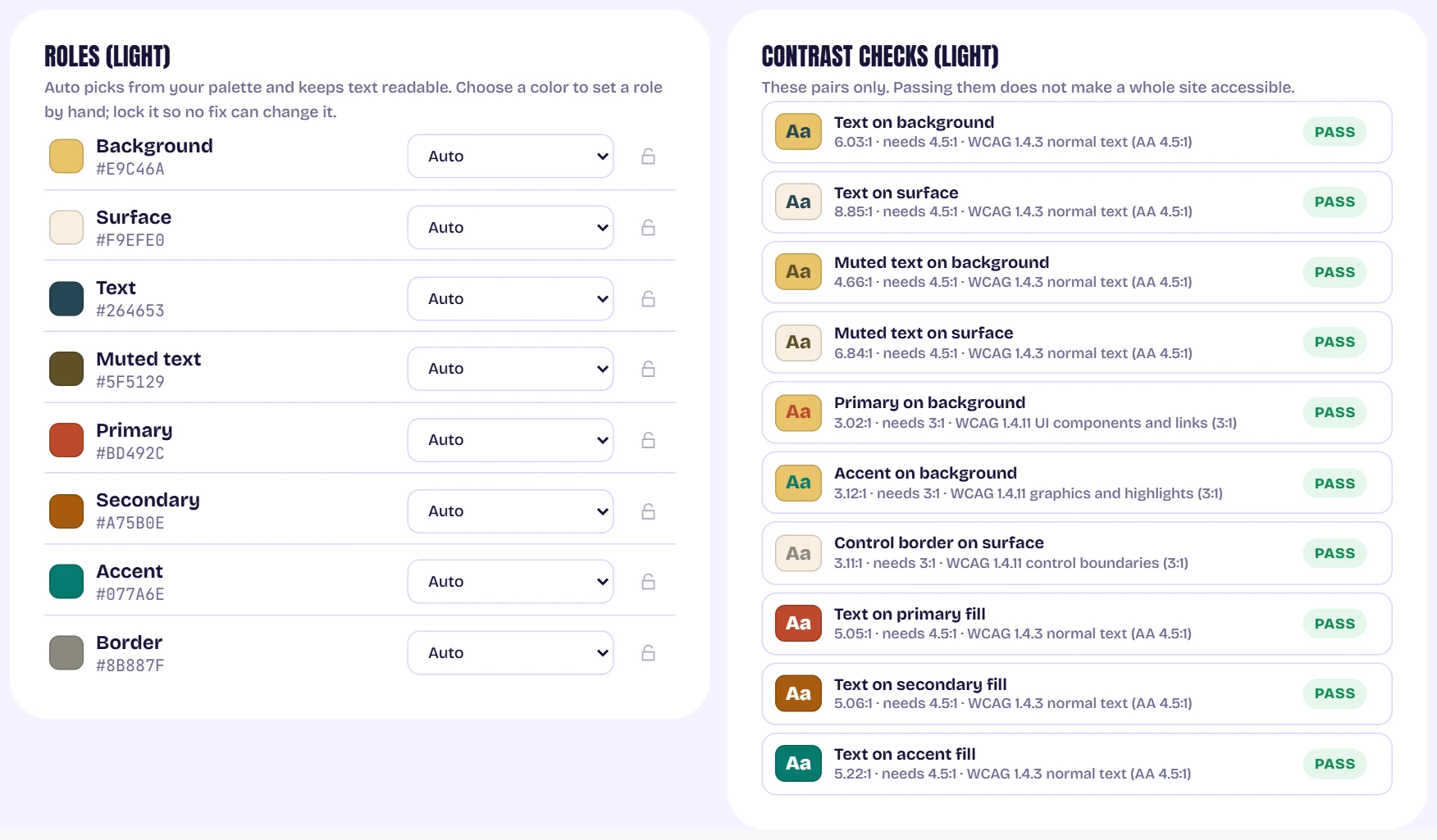
The Roles list with Auto dropdowns and padlocks, beside the list of ten contrast checks all passing Fix a failing pair
When a pair fails, a button offers a replacement color that makes every pair for that role pass. Press it to apply. A locked role shows Locked instead, so your brand color is never changed behind your back.
Switch to dark mode, or generate a new palette
The Light and Dark switch in the palette bar gives each mode its own roles, and the illustrations swap to a dark background. Dark values are derived from your palette and checked the same way. Generate (or the space bar) makes a new palette, and the plus and minus buttons add or remove a color, from 2 up to 12.
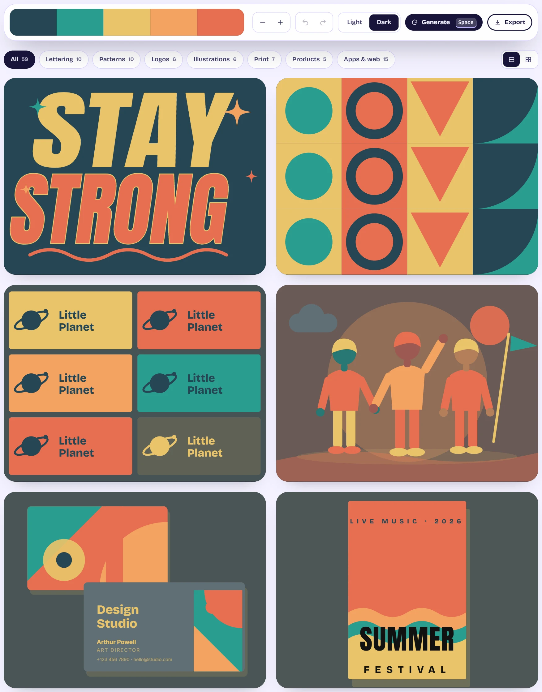
The visualizer in dark mode: the gallery tiles on a dark background with the palette bar above them Export the theme
Export theme opens the download dialog. The Light/dark theme format gives one CSS file with both modes: it follows the visitor's system setting, and you can force a mode with data-theme on the html element. It also includes a Tailwind v4 mapping.
Tips
- Your roles and palette are remembered in this browser, so a refresh does not lose them.
- Only the listed pairs are checked. Passing does not make a whole site accessible.